Communicating Ideas Clearly with the Core Value Icon Pack
Why Visual Symbols Matter in Modern Communication
In a world flooded with information, the ability to convey a message instantly is essential. Icons serve as a universal visual shorthand, breaking down language barriers and speeding up comprehension. Whether you are designing a corporate website, assembling a pitch deck, or building an app interface, well-chosen symbols create emotional resonance and guide the user’s eye without adding clutter. The Core Value Icon Pack addresses this need by offering a carefully curated collection that translates abstract concepts like trust, innovation, and sustainability into recognizable, appealing graphics.
Unlike stock imagery that can feel generic or dated, this icon set focuses on popular services and ideas—themes that recur across industries. A single glance at a shield icon representing security or a handshake denoting partnership can set the tone before a single word is read. This makes the pack especially valuable for time-sensitive projects where design teams need to maintain both speed and quality. Because the icons are available in multiple file formats and styles, they adapt without losing their communicative power, from crisp mobile screens to large-format presentation displays.
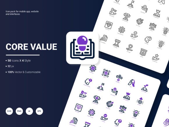
200 Icons Covering a Broad Spectrum of Concepts
One of the biggest challenges in visual design is finding a set that covers all the core messages a brand or project might need. With 200 distinct icons, the Core Value Icon Pack spans categories like safety, empathy, collaboration, leadership, and efficiency. This breadth allows a single coherent look across an entire client proposal, an annual report, or an e-learning platform. Because the themes are intentionally chosen to reflect popular content, users can illustrate team values, product benefits, and service pillars without commissioning custom artwork for every instance.
Four Unique Visual Styles for Different Tones
The pack includes four distinct icon styles, each capable of setting a completely different mood. While some projects demand a clean, minimal line-art look for a tech startup website, others might need a bold, solid fill that pops in an infographic. Having multiple styles in one collection means you can present the same concept—such as “growth”—as a delicate outline for a corporate values page, a vibrant flat vector for a social media graphic, or even a duotone composition for a modern presentation. This flexibility saves hours of manually editing a single-style set to fit different mediums.
Six File Formats for Seamless Integration
Designers rarely work in just one environment. A vector masterpiece might need to become a PowerPoint graphic, a WordPress section, or a printed brochure. The inclusion of AI, EPS, SVG, PNG, PDF, and JPG formats covers nearly every use case:
- AI and EPS – Native vector files ideal for scaling to any size without quality loss, perfect for Adobe Illustrator workflows and professional print.
- SVG – The gold standard for web and app interfaces, offering tiny file sizes, infinite scalability, and direct code manipulation for color changes and animations.
- PNG – Transparent-background raster files at high resolution, ready to drop into presentations, documents, and image-based editors.
- PDF – A versatile format for sharing proofs, embedding in reports, or sending to clients who may not have specialized design software.
- JPG – Useful when a compact, universally viewable file is needed for quick email attachments or social media previews.
This formatting strategy means a single icon can journey from a wireframe in Figma to a printed banner without ever needing to be redrawn. The pack’s commitment to editability further enhances this. Colors, strokes, and even individual elements can be adjusted in vector programs, ensuring the icons never clash with an existing brand palette.
Website Design That Feels Cohesive and Purposeful
A company’s website often serves as the first point of contact, and the icons sprinkled throughout its “About Us” or “Services” sections silently influence perception. The Core Value Icon Pack’s SVG format allows developers to embed icons directly into the code with lightweight markup, ensuring fast load times. Using a consistent icon style across the homepage, blog, and landing pages creates visual harmony. For instance, a consulting firm might use a set of line-style icons for integrity, analysis, and mentoring, while a health-tech startup might select the same icons in a vibrant flat style to convey warmth and accessibility.
Mobile Apps That Communicate Instantly
Screen real estate in mobile applications is limited, and every pixel must earn its place. Icons replace lengthy labels, making navigation intuitive and reducing cognitive load. PNG or SVG versions from the pack integrate easily into both iOS and Android design systems. When users see a recognizable magnifying glass for search or a heart for health metrics, they can interact without hesitation. Having 200 choices means even niche features—like a “document verification” or “environmental impact” module—can have a custom-feeling icon without a custom price tag.
Compelling Presentations and Analytical Reports
Data without context is forgettable. Whether you are presenting quarterly earnings, performance metrics, or strategic roadmaps, icons act as visual anchors that help audiences remember key figures. In slide decks, a PNG placed next to a statistic, such as a shield icon beside a 99% uptime guarantee, reinforces the message before the audience reads the number. PDF versions of the icons can be embedded directly into financial reports or whitepapers, where vector crispness ensures professional print results. The Core Value Icon Pack makes it simple to apply the same icon set across a PowerPoint presentation and the accompanying printed handout, reinforcing brand identity throughout.
Infographics That Tell a Story at a Glance
Infographics thrive on clarity, and icons are essential building blocks. Instead of relying solely on charts, you can illustrate steps in a process with icons that symbolize each phase—concept, development, launch, feedback. The pack’s four styles allow a single infographic to use a primary bold style for headers and a subtle line variant for supporting details, creating depth without visual chaos. Because the vectors are editable, designers can unify the color scheme to match company red, eco green, or innovative blue, ensuring the graphic feels native to the brand.
Customizable Templates that Save Time and Effort
Marketing teams, educators, and event coordinators frequently reuse templates for newsletters, course materials, or event flyers. Dropping the same icons into these templates month after month builds a recognizable visual language. Templates designed around the Core Value Icon Pack can include placeholder areas where any of the 200 icons can be swapped in as the topic changes. The mix of AI and SVG files allows these templates to be used in both professional design software and simpler DIY tools like Canva, where SVG and PNG uploads are supported.
Considerations for Consistent Branding and Long-Term Use
Adopting an icon pack across an organization requires a thoughtful approach to maintain brand integrity. Before integrating the icons, it helps to define a simple style guide: which of the four styles aligns with the brand personality, what colors will be applied, and in what contexts SVG rather than PNG is preferred. Because the pack is easily edited, you can tweak line weights, add subtle gradients, or even combine elements from two icons to create a hybrid symbol unique to your project. However, consistency is key—once a style is chosen for a platform, it should be used throughout to avoid confusing the audience.
Accessibility is another critical factor. When icons are used in digital interfaces, adding descriptive alt text or aria-labels ensures that screen readers convey the intended meaning. The simplicity of these icons actually aids accessibility because their clear silhouettes are easily understood even when scaled down, and their vector nature means they remain sharp for users who zoom in.
Observations from Real-World Design Workflows
In agile environments, design sprints move quickly, and waiting for custom icon creation can cause bottlenecks. Many teams adopt icon packs as a pragmatic middle ground—they offer the visual quality of custom work with the speed of pre-made assets. The Core Value Icon Pack fits this niche because it doesn’t just offer random decorative images; it provides symbols tied to services and ideas that businesses actually talk about. A project manager, for example, can swiftly pull icons for milestones, collaboration, and deadline without briefing a designer for three days. Meanwhile, a UX designer can use the same set in high-fidelity mockups and later hand off the SVG code to developers for implementation, maintaining pixel-perfect consistency from concept to production.
The ability to bounce between the four styles is a subtle yet powerful workflow advantage. During a rebrand, a company might transition from a playful flat style to a more refined line style without having to source an entirely new icon library. Because the concepts remain constant, the only change is the visual treatment, which can be done in minutes by replacing style sheets or source files.
Looking Ahead: Evolving the Icon Collection
No icon set is ever truly complete, because new services and cultural values emerge as industries change. The creators of the Core Value Icon Pack have built a solid foundation with 200 icons that address today’s most talked-about concepts, but user feedback is vital for growth. If you’re using the pack in a field like sustainable architecture, telehealth, or financial literacy, your real-world experience can highlight gaps. Perhaps the next update could include more specialized icons for remote collaboration, artificial intelligence ethics, or micro-mobility. Additional file formats such as Lottie animations for web motion or Figma components could also streamline modern design pipelines. Sharing what you’ve needed but couldn’t find helps the pack become even more relevant for a broader range of professionals.
For those who integrate the icons into templates, a request for pre-built slide masters or social media canva-size layouts might arise. Others might wish for expanded color palette examples or ready-to-use combinations that pair well with each of the four styles. Whatever direction the feedback takes, the pack’s flexible architecture—rooted in universally editable vector formats—means future additions can be adopted without disrupting existing projects.
Making the Most of Your Icon Investment
To fully realize the value of any resource like this, treat it as a living part of your design system rather than a one-time download. Organize the icons on a shared drive or cloud-based component library where team members can pull from a single source of truth. Annotate the files with keywords so that “trust,” “integrity,” and “security” all point to the same shield icon, preventing duplicate concept use. The Core Value Icon Pack becomes more than just a collection of images—it evolves into a consistent visual vocabulary that speaks clearly and confidently across every channel you manage.
